Branding
About Branding
Branding lets you customize your organization's logos and color theme in the Vega Platform. Configure each setting individually, or use Guided Setup for a step-by-step walkthrough.
Click "Guided Setup" to configure your branding in just a few steps.
Logo Tab
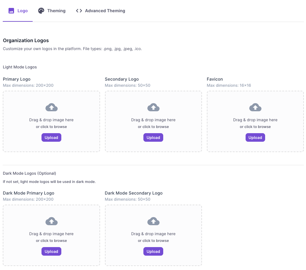
Organization Logos
Customize your organization's logos in the platform. You can drag and drop images or click the "Upload" button to browse for files.
- Accepted file types:
.png,.jpg,.jpeg,.ico - Max file size: 1 MB
- File names must be 1–200 characters, containing only letters, numbers, underscores (
_), or dashes (-).
Light Mode Logos
| Logo Type | Max Dimensions | Description |
|---|---|---|
| Primary Logo | 200 × 200 px | Displays when the sidebar is maximized |
| Secondary Logo | 50 × 50 px | Displays when the sidebar is minimized |
| Favicon | 16 × 16 px | Browser tab icon |
Dark Mode Logos (Optional)
If not set, light mode logos will be used in dark mode.
| Logo Type | Max Dimensions |
|---|---|
| Dark Mode Primary Logo | 200 × 200 px |
| Dark Mode Secondary Logo | 50 × 50 px |
Theming Tab
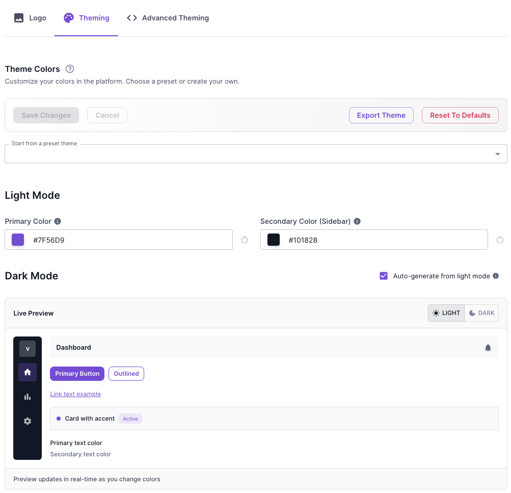
The Theming tab allows you to customize the color scheme of your Vega Platform experience. Changes are previewed in real-time before saving.
Theme Colors
Customize your platform colors by choosing a preset theme or creating your own custom color scheme.
| Option | Description |
|---|---|
| Start from a preset theme | Select a pre-configured color palette as a starting point |
| Save Changes | Apply your custom theme to the platform |
| Cancel | Discard unsaved changes |
| Export Theme | Download your theme configuration for backup or sharing |
| Reset To Defaults | Restore the original Vega Platform colors |
Light Mode
Configure the colors displayed when the platform is in light mode:
- Primary Color — The main accent color used for buttons, links, and interactive elements
- Secondary Color (Sidebar) — The background color of the navigation sidebar
Dark Mode
Configure the colors displayed when the platform is in dark mode. Enable "Auto-generate from light mode" to automatically create dark mode colors based on your light mode settings, or customize them manually.
Live Preview
The Live Preview panel shows how your color choices will appear across common UI elements including buttons, links, cards, and text. Toggle between LIGHT and DARK modes to preview both themes before saving.
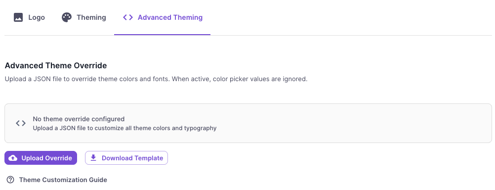
Advanced Theming Tab
The Advanced Theming tab provides full control over your platform's visual styling through JSON configuration. This is ideal for organizations that need precise control over colors and typography beyond what the standard Theming tab offers.
Advanced Theme Override
Upload a custom JSON file to override theme colors and fonts. When a theme override is active, the color picker values from the Theming tab are ignored.
| Option | Description |
|---|---|
| Upload Override | Upload a JSON file containing your custom theme configuration |
| Download Template | Download a starter JSON template to use as a base for customization |
Click the "Theme Customization Guide" link for detailed instructions on JSON structure and available customization options.